Liveboards
 Updated
by
Arianne G.
Updated
by
Arianne G.
Liveboards are dashboards where you can collect related charts and tables. You can also share liveboards with other users, and you can filter liveboards and drill down to see more specific information. You can find a list of your saved liveboards on the Liveboards tab.
Create a liveboard
- In XactInsights, click the Liveboards tab.
- Click
 . The New Liveboard window will appear.
 - Enter a name and description for your liveboard.
- Click Create.
Save an answer to a liveboard
- On the answer, click
 . The Pin to Liveboard window will appear.
 - Click the name of the liveboard that you want to add your answer to.
- You can also click Create Liveboard if you have not already created the liveboard. You can then add your answer to the newly created liveboard.
- Click Pin.
Provided liveboards
XactInsights also provides several pre-built liveboards for your use:
Assignment Activity and Volume
Assignment Activity and Volume
The Assignment Activity liveboard allows you to quickly view assignment activity and volume statistics for your company at the country, state, and postal code level.
Assignment Activity tab
There are eight boxes across the top of the liveboard.
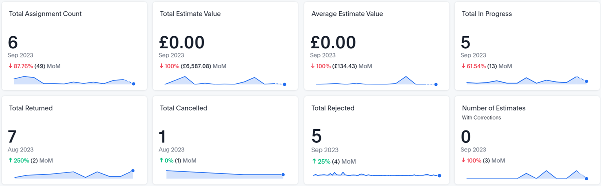
Four of the boxes provide overview numbers for the assignments and estimates that fall within your selected filters:
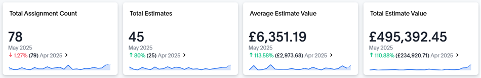
Total Assignment Count
This box displays the total number of assignments that fall within your selected filters.
Number of Estimates with Corrections
This box displays the total number of estimates with corrections that fall within your selected filters.
Average Estimate Value
This box displays the average estimate value of the estimates that fall within your selected filters.
Total Estimate Value
This box displays the sum of all estimate values that fall within your selected filters.
The other four boxes each contain an XactAnalysis status and the number of assignments in the liveboard that have that status:
Total In Progress
The number of assignments that are currently assigned to an assignee or collaborator.
Total Returned
The number of assignments that were completed and uploaded to XactAnalysis.
Total Canceled
The number of assignments that were canceled.
Total Rejected
The number of assignments that were rejected by an assignee.
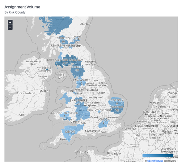
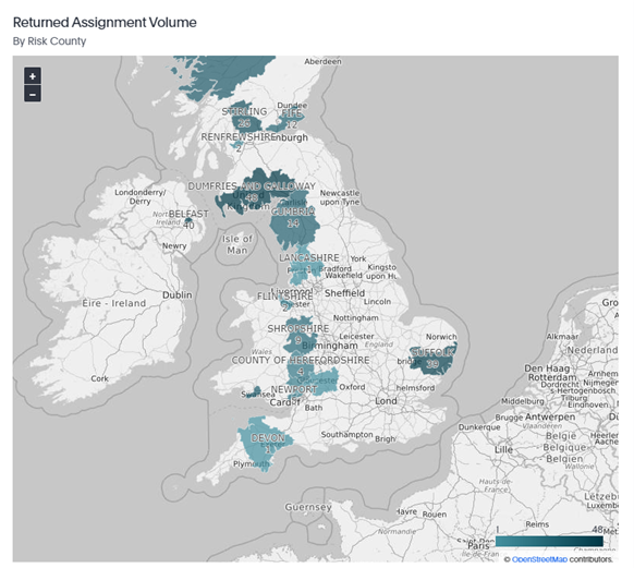
Maps
The two maps in the liveboard are visual representations of the number of assignments and returned assignments your company has in each county. The darker the color, the higher the concentration of claims. Areas with a gray color don’t contain any data.
Charts and graphs
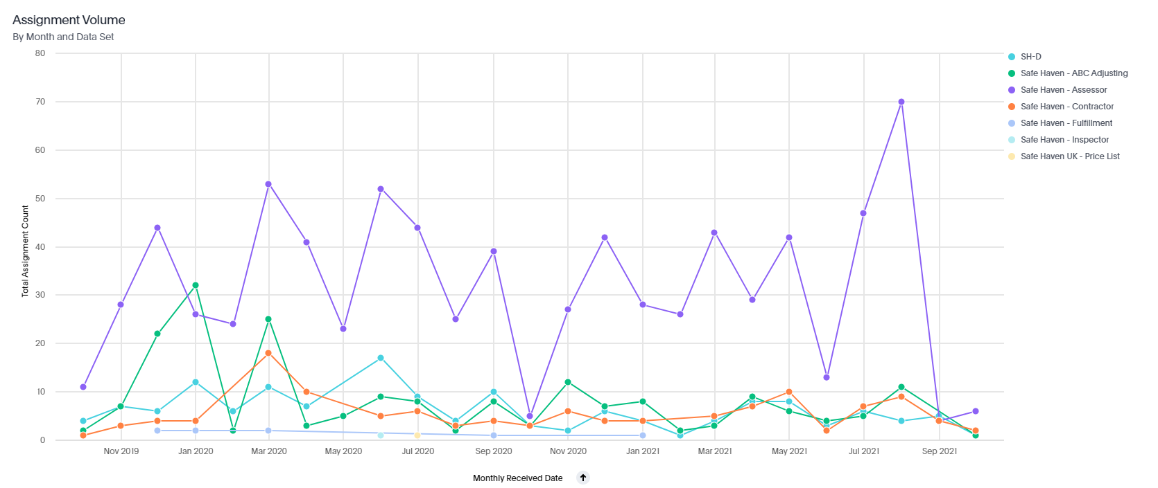
There are also several charts and graphs to help you visualize your data, including Assignment Volume by Month and Data Set.
Assignment Volume tab
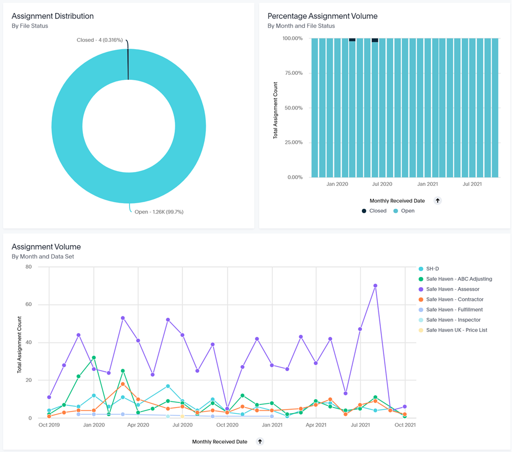
The Assignment Volume liveboard displays assignment statistics such as the total number of closed assignments, the total number of open assignments, and the Assignment Distribution by File Status.
Average Value
Average Value
The Average Value liveboard displays the average estimate value for your organisation. You can filter this information several ways, including by data set, job type, and type of loss.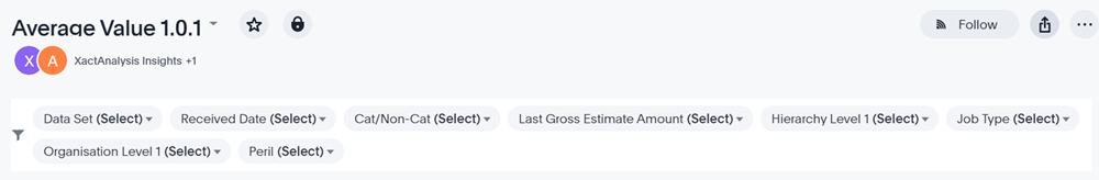
The liveboard begins with four key performance indicators (KPIs): Total Estimate Count, Total Estimates, Average Estimate Value, and Total Estimate Value.
There are also several charts and graphs to help you visualize your data.
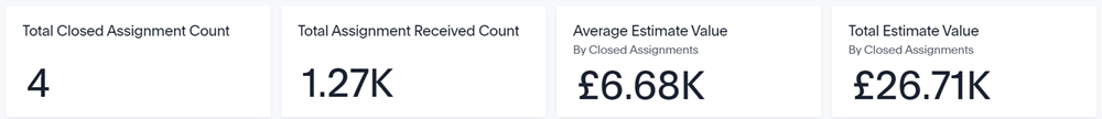
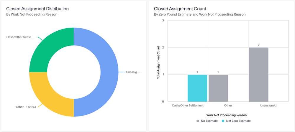
Closure Summary
Closure Summary
The Closure Summary liveboard provides summary information about closed assignments. You can easily see the total closed assignments count, total assignments received count, and more.
There are also several charts and graphs to help you visualize your data.
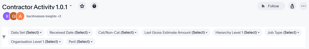
Contractor Activity
Contractor Activity
The Contractor Activity liveboard displays various contractor statistics for your account. You can filter this information several ways, including by data set, received date, and organisation level.
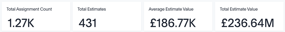
The liveboard begins with four key performance indicators (KPIs): Total Assignment Count, Total Estimates, Average Estimate Value, and Total Estimate Value.
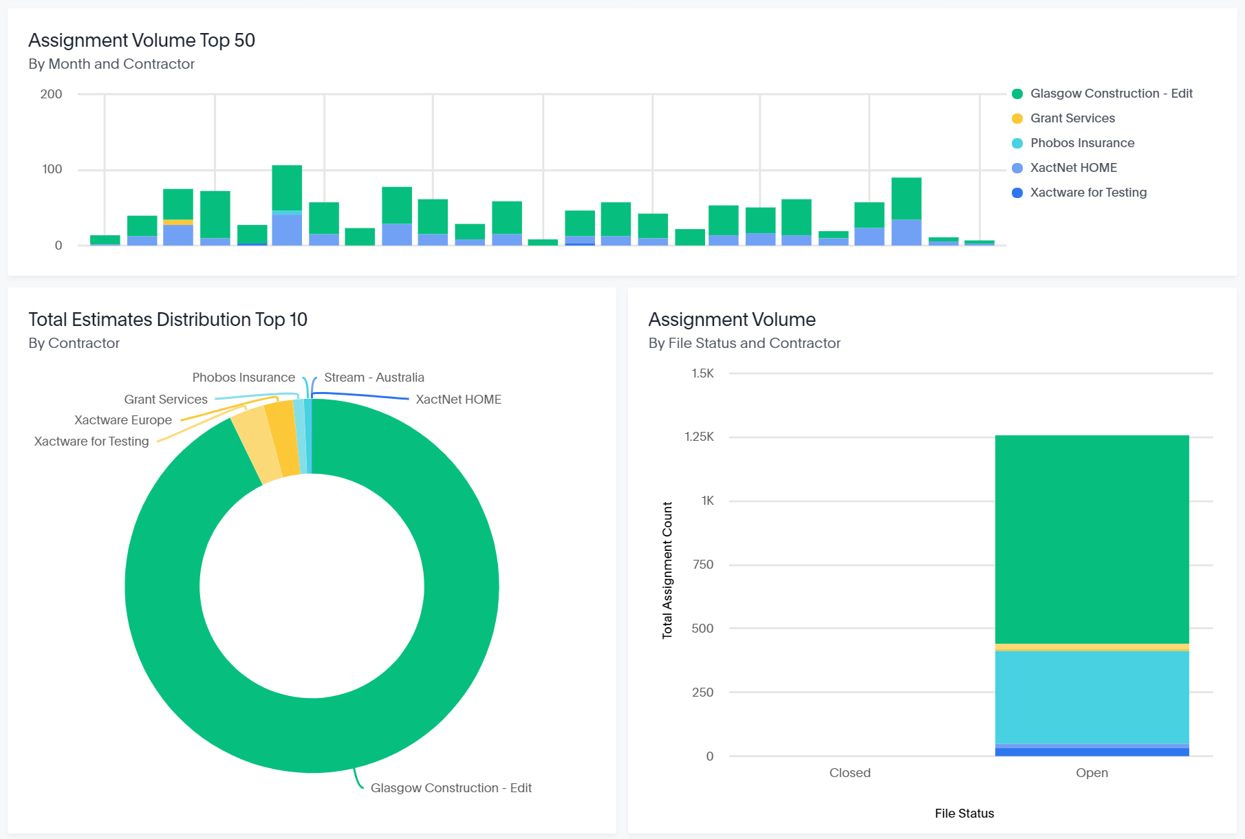
There are also several charts and graphs to help you visualize your data.
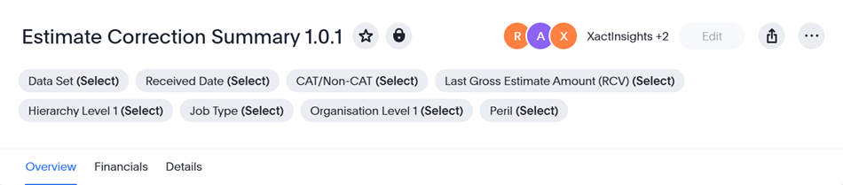
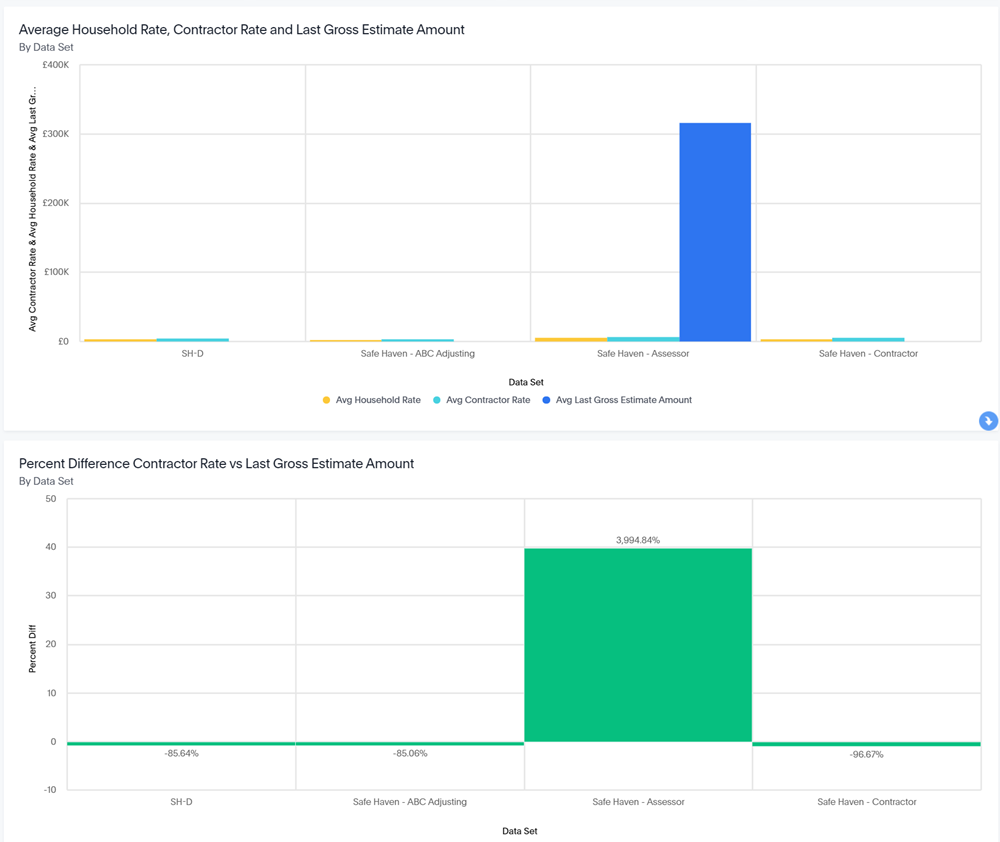
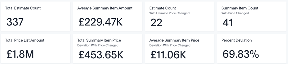
Estimate Correction Summary
Estimate Correction Summary
This liveboard is based on the Estimate Correction Summary management report in XactAnalysis; you can use this liveboard to track corrections on estimates and monitor the changes in the final estimate value.
Filters
You can filter the entire liveboard by data set, received date, CAT/Non-CAT, RCV, hierarchy level, job type, organisation level, and type of loss. These filters are located at the very top of the liveboard.
You can also see filtered data for single visualisations:
- Find the desired visualization and click Explore. The Explore window opens.
- Click Filter.
- Either select one of the suggested filters or create and apply your own.
Overview tab
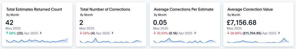
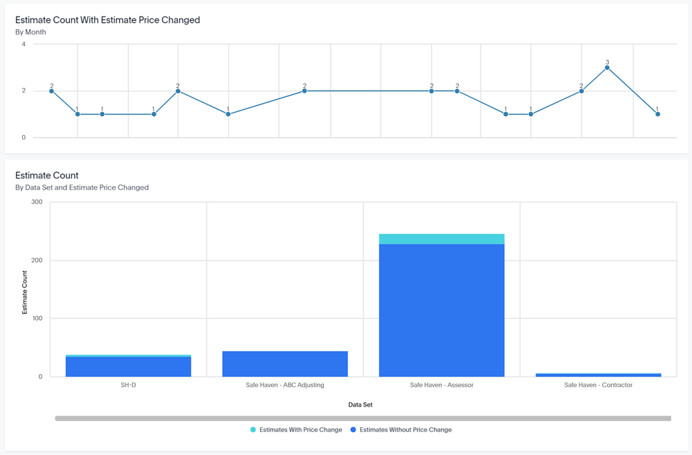
Key Performance Indicator (KPI) charts
There are four KPI charts across the top of the Overviews tab: Total Estimates Returned Count by Month, Total Number of Corrections by Month, Average Corrections per Estimate by Month, and Average Correction Value by Month.
Visualisations
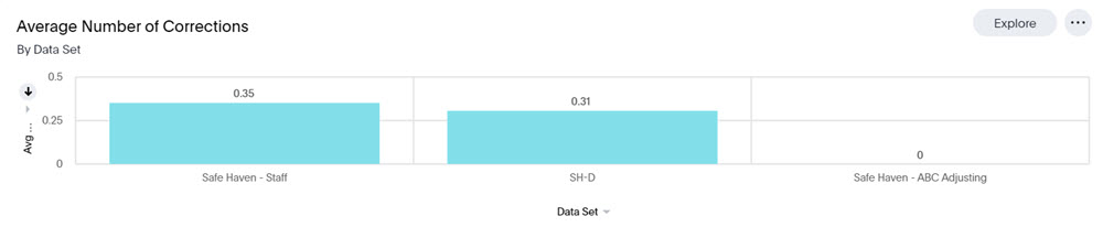
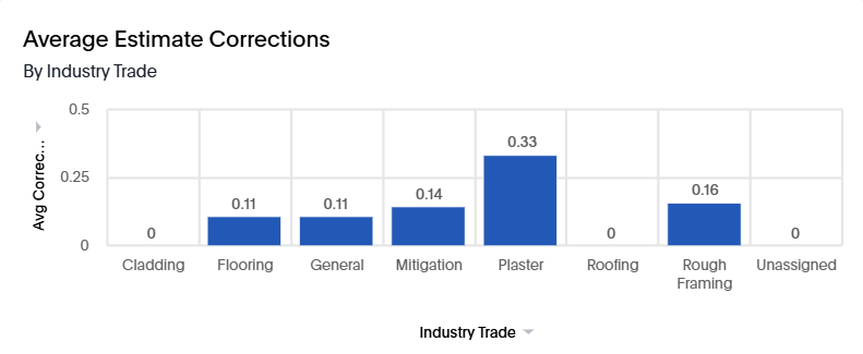
This tab contains several charts, graphs, and tables to help you analyse your estimate correction data, including:
Average Number of Corrections by Data Set
This graph displays and compares the average number of corrections for each data set.
Average Estimate Corrections by Industry Trade
This graph displays and compares the average number of estimate corrections for each industry trade.
Financials tab
Visualisations
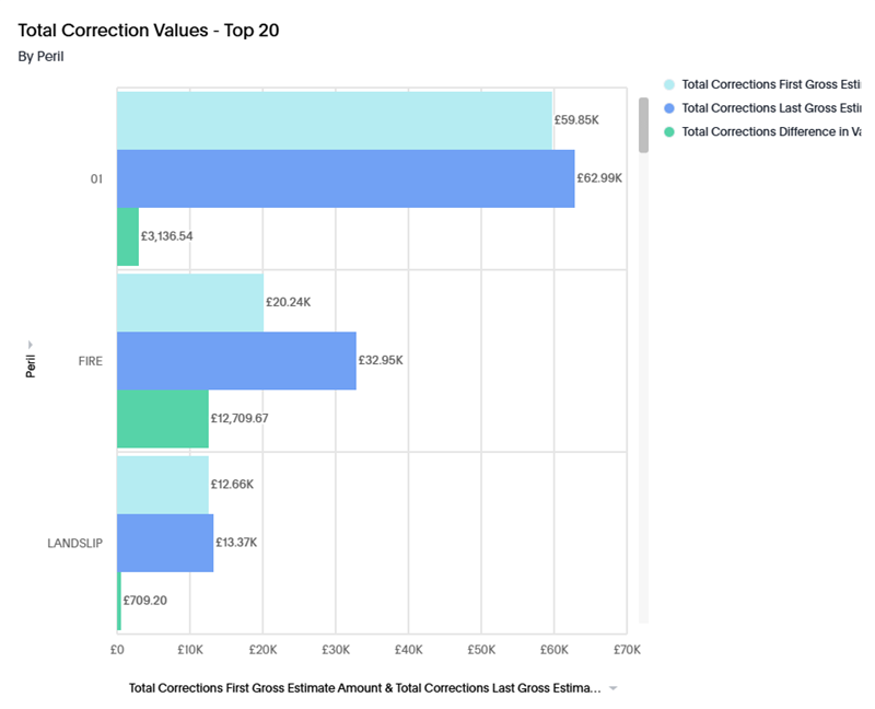
This tab contains several charts, graphs, and tables to help you analyse your estimate correction financial data, including:
Total Correction Values - Top 20 by Type of Loss
This graph displays the total correction amounts for the top 20 types of loss.
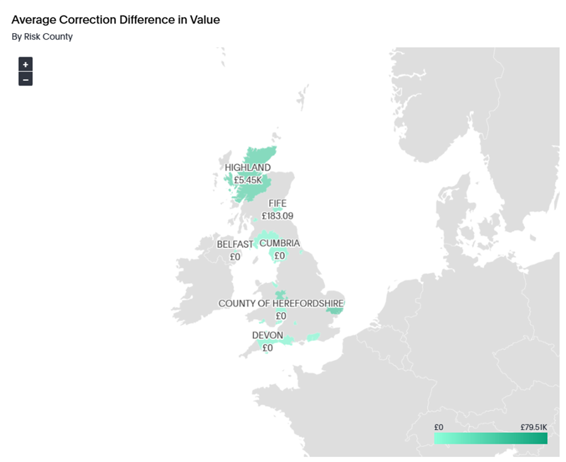
Average Correction Difference in Value by Risk County
This graph displays and compares the average correction difference for each risk county. You can zoom in on the map to see more detail.
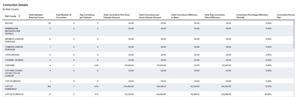
Details tab
The Details tab hosts the Correction Details by Risk County table, which shows estimate correction data for different risk counties. Definitions for the table columns are located directly above the table.
Estimate Values
Estimate Values
The Estimate Values liveboard allows you to quickly view estimate values for your company based on your company estimates from the past two years. The liveboard is interactive and updates based on the filters that you select.
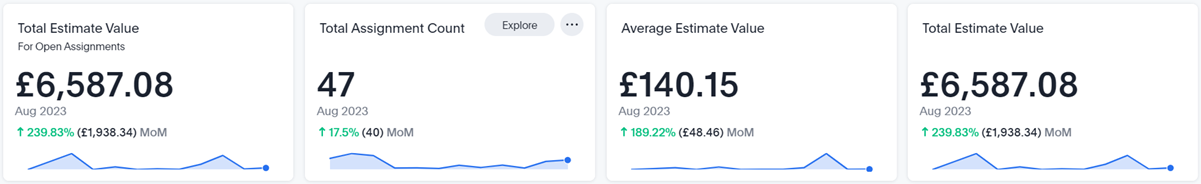
Total Estimate Value for Open Assignments
This box displays the value of all the estimates for open assignments.
Total Assignment Count
This box displays the total number of assignments that fall within your selected filters.
Average Estimate Value
The Total Estimate Value divided by the Total Assignment Count.
Total Estimate Value
The value of all the estimates.
Visualizations
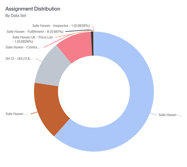
Assignment Distribution by Data Set
This donut chart displays the percentage of assignments that belong to each of the data sets in your company.
There are also several other charts and graphs to help you visualize your data.
Flooring
Flooring
The Flooring liveboard allows you to quickly view flooring statistics for your company.
Filters
You can filter the entire Flooring liveboard by data set, received date, CAT/non-CAT, category code, job type, selector code, and peril. These filters are located at the very top of the liveboard.
You can also see filtered data for single graphs or tables:
- Hover over the desired visualisation and click Explore. The Explore window opens.
- Click Filter.
- Either select one of the suggested filters or create and apply your own.
Visualisations
This liveboard contains several graphs and tables to help you analyse your flooring data.
Total Flooring Square Meters by Month
This graph displays the total square meters of different flooring items for each month. You can see monthly totals for carpet, carpet pad, tile, stone, wood, and more. You can click each flooring type to remove it from the graph.
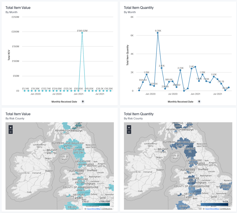
Total Item Value by Flooring Category and Unit
This graph displays the total values of flooring items for different categories and units.
Total Item Quantity by Flooring Category and Unit
This graph displays the total quantities of flooring items for different categories and units.
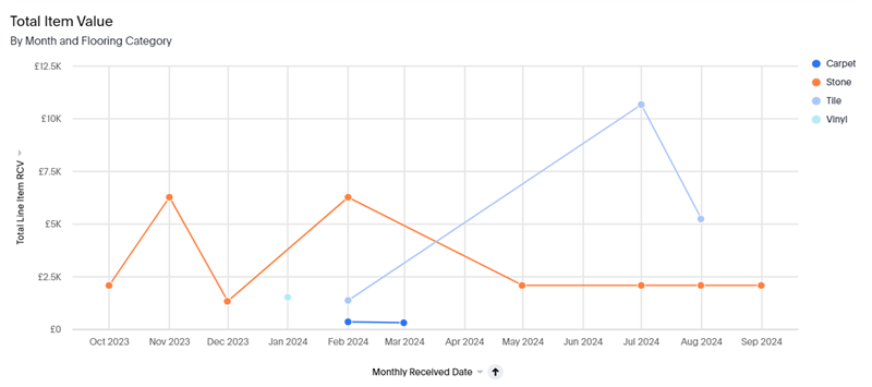
Total Item Value by Month and Flooring Category
This graph displays the total item values of different flooring for each month. You can see monthly totals for carpet, carpet pad, tile, stone, wood, and more. You can click each flooring type to remove it from the graph.
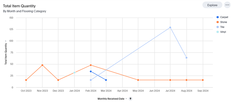
Total Item Quantity by Month and Flooring Category
This graph displays the total item quantities of different flooring for each month. You can see monthly totals for carpet, carpet pad, tile, stone, wood, and more. You can click each flooring type to remove it from the graph.
Total Flooring Square Meters by Flooring Category and Risk State
This table filters for flooring items with square meters as the unit and displays the price and quantity of those line items based on their square meters. You can change the order that the total item quantity and total item price appear in by dragging them to the upper left corner of the table.
You can also filter and sort the table by risk state, flooring category, total item price, and total item quantity.
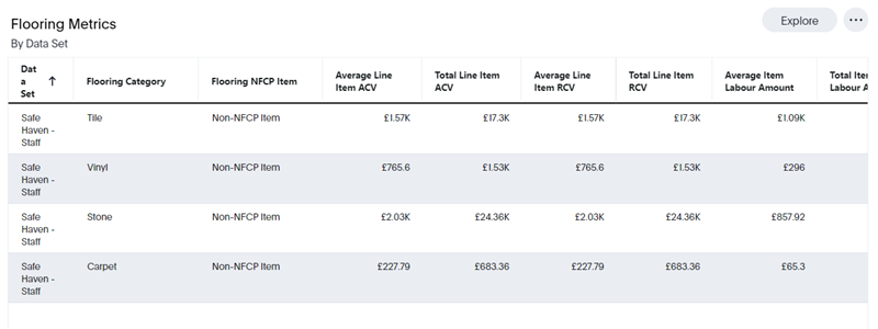
Flooring Metrics by Data Set
This table displays various statistics for each of your data sets, including Average Line Item ACV, Total Line Item ACV, Average Line Item RCV, Total Line Item RCV, Average Item Labour Amount, Total Item Labour Amount, Average Item Material Amount, and Total Item Material Amount.
Line Item
Line Item
The Line Item liveboard allows you to quickly view line item information, including the average ACV, the average item equipment amount, and the average item labor amount.
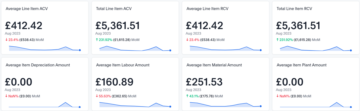
There are also several charts and graphs to help you visualize your data.
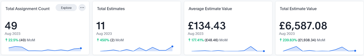
Peril
Peril
The Peril liveboard allows you to quickly view peril data for your company, including the Average Estimate Value, Total Estimate Value, and Percentage of Total Estimate Value Top 10 by Peril.
Filters
You can filter the entire liveboard by data set, received date, CAT/Non-Cat, RCV, hierarchy level, job type, organisation level, and peril. These filters are located at the very top of the liveboard.
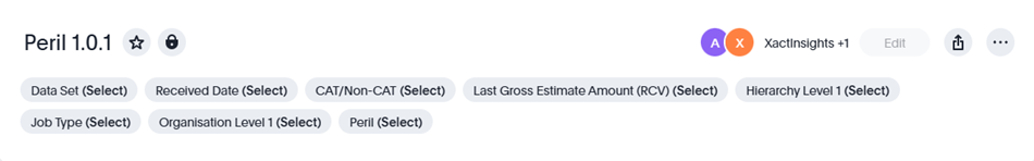
You can also see filtered data for single visualisations:
- Find the desired visualisation and click Explore. The Explore window opens.
- Click Filter.
- Either select one of the suggested filters or create and apply your own.
Key Performance Indicator (KPI) charts
There are four KPI charts across the top of the liveboard: Total Assignment Count, Total Estimates, Average Estimate Value, and Total Estimate Value.
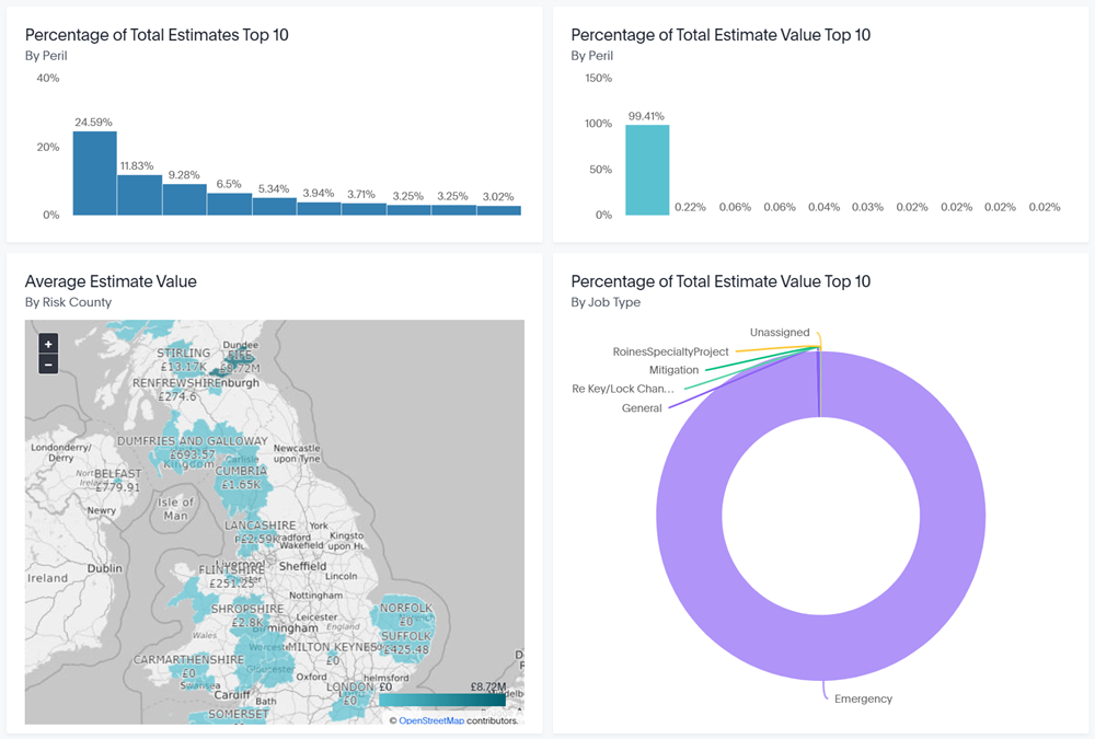
Visualisations
This liveboard contains several charts, graphs, and tables to help you analyse your peril data, including:
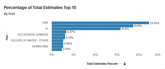
Percentage of Total Estimates Top 10 by Peril
This graph displays the top 10 total estimate percentages for different perils.
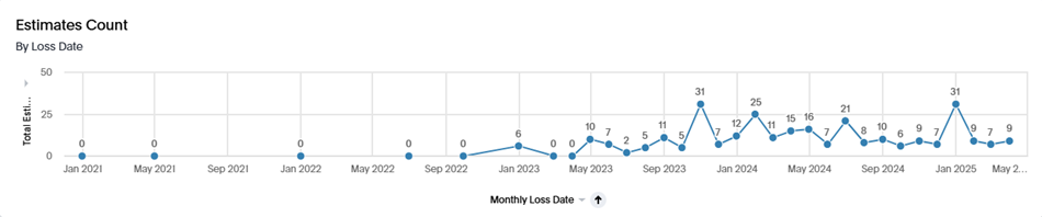
Estimates Count by Loss Date
This graph displays the total estimates count by the monthly loss date.
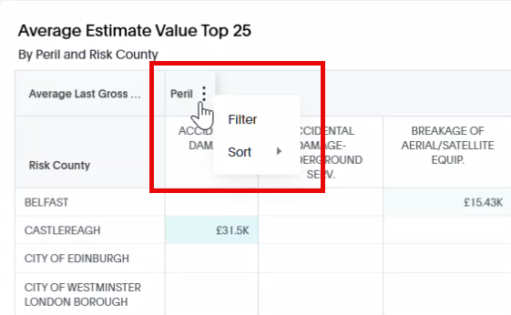
Average Estimate Value Top 25 by Peril and Risk County
This table displays the top 25 average estimate values for risk counties and perils.
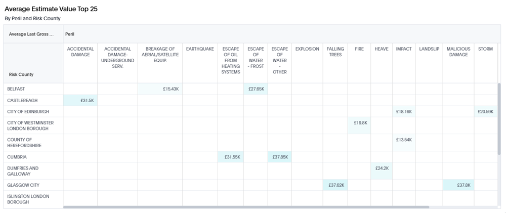
You can sort and filter the table by the average last gross estimate amount, peril, and risk county. Simply hover over the column name, click the More  menu, and select either Filter or Sort.
Price Deviation
Price Deviation
The boxes across the top of the liveboard provide overview numbers for the estimates that fall within your selected filters.
Visualisations
There are several charts and graphs to help you visualise your data.
Response Time
Response Time
The four boxes across the top of the liveboard provide overview numbers for the assignments and estimates that fall within your selected filters.

Total Assignment Count
This box displays the total number of assignments that fall within your selected filters.
Total Estimates
This box displays the total number of estimates that fall within your selected filters.
Average Estimate Value
This box displays the average estimate value of the estimates that fall within your selected filters.
Total Estimate Value
This box displays the sum of all estimate values that fall within your selected filters.
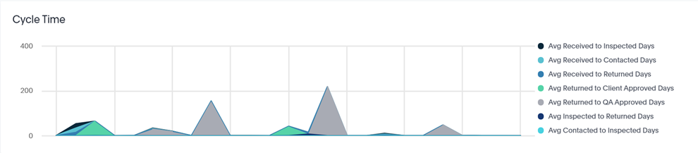
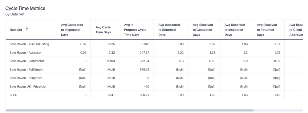
Cycle Time
The Cycle Time graph displays the average response times for your company, according to your filter selections.
Cycle Time Metrics by Data Set
The table at the bottom of the liveboard allows you to view and compare the response times for your company's data sets.
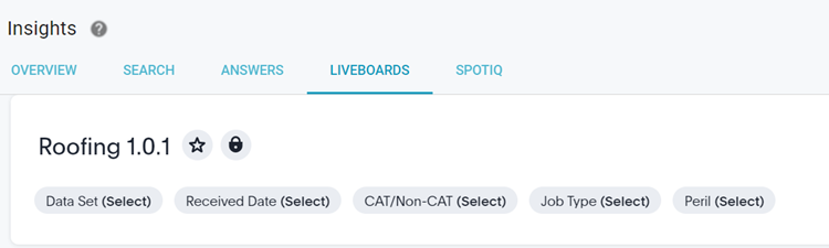
Roofing
Roofing
The Roofing liveboard allows you to quickly view roofing statistics for your company, including Average Roofing Squares, Percent of Assignments with RCV > $0, and Roofing Metrics by Data Set.
Filters
You can filter the entire liveboard by data set, received date, CAT/non-CAT, job type, and peril. These filters are located at the very top of the liveboard.
You can also see filtered data for single visualisations:
- Find the desired visualisation and click Explore. The Explore window opens.
- Click Filter.
- Either select one of the suggested filters or create and apply your own.
Key Performance Indicator (KPI) charts
There are four KPI charts across the top of the liveboard: Total Repair Estimate Count, Repair Estimate Count by Month, Total Replace Estimate Count, and Replace Estimate Count by Month.
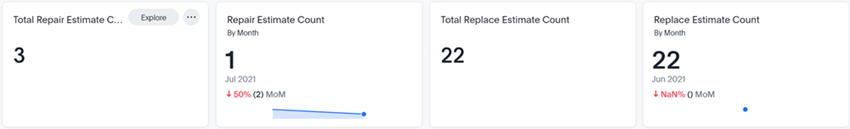
- Total Repair Estimate Count
- This shows the total number of estimates that had roof damage claims that were classified as a repair.
- Repair Estimate Count by Month
- This shows the number of estimates in the selected month that had roof damage claims that were classified as a repair. The month for this KPI defaults to the most recent, but you can change it in the filters.
- Total Replace Estimate Count
- This shows the total number of estimates that had roof damage claims that were classified as a replacement.
- Replace Estimate Count by Month
- This shows the number of estimates in the selected month that had roof damage claims that were classified as a replacement. The month for this KPI defaults to the most recent, but you can change it in the filters.
Visualisations
This liveboard contains several charts, graphs, and tables to help you analyse your roofing data, including:
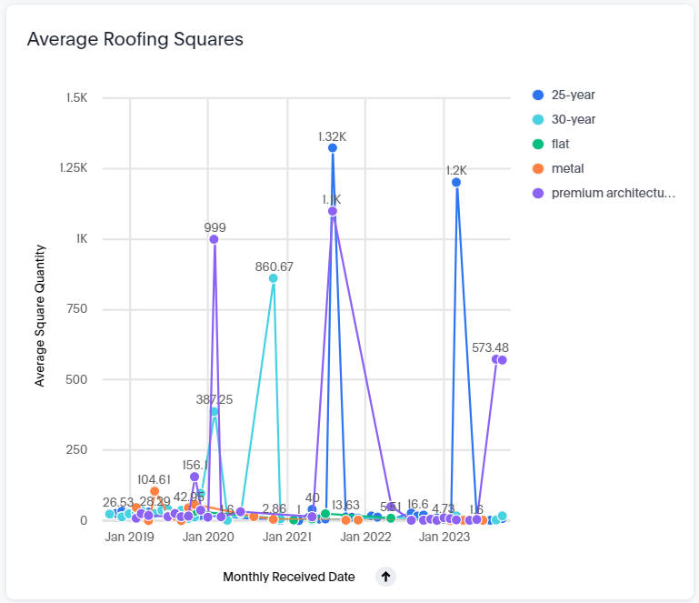
Average Roofing Squares
This graph displays the average roofing square quantity over time. It also differentiates between different types of roofing squares: 25-year, 30-year, flat, metal, and premium architectural/laminated. You can click each roofing square type to remove it from the graph.
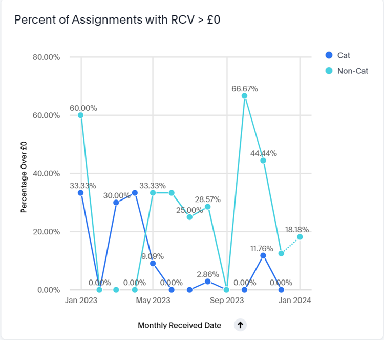
Percent of Assignments with RCV greater than £0
This graph displays the percentage of assignments that had an RCV greater than $0 over time. It also differentiates between CAT and Non-CAT assignments. You can click the CAT or Non-CAT labels to remove that assignment type from the graph.
Roofing Metrics by Data Set
This table displays various statistics for each of your data sets, including: Roof Damage Type, Total Line Item RCV, Total Line Item ACV, Average Line Item RCV, Average Line Item ACV, Average Item Labour Amount, Total Item Labour Amount, Average Item Material Amount, and Total Item Material Amount.
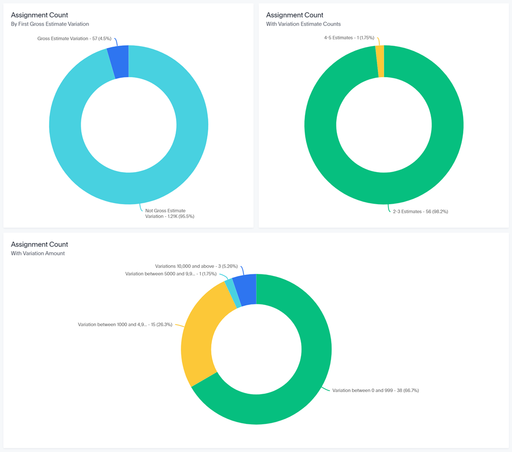
Variation Returns
Variation Returns
The Variation Returns liveboard allows you to quickly view variation statistics for your company from the past two years. The liveboard is interactive and updates based on the filters that you select.
The boxes across the top of the liveboard provide variation return numbers for the estimates that fall within your selected filters.
There are also several charts and graphs to help you visualize your data.